The Surprising Furniture Colour Mistake Aged Care and Retirement Villages Make – And How to Avoid It

Choosing the right colours for furniture upholstery in aged care and retirement living spaces can be a daunting task. In our 25 years in the business, we’ve seen some facility and village managers unknowingly make a common mistake in their colour choices; and this can impact the comfort and well-being of residents.
Here, we’ll explore this surprising mistake and provide practical steps to help you avoid it, ensuring a harmonious and welcoming environment for residents.
The Importance of Colour in Interior Design
Colour is more than just a visual element; it plays a crucial role in influencing mood, comfort, and overall well-being. In aged care settings, the right colour choices can promote calmness, enhance mental health, and support mobility and independence. However, many facilities overlook the impact of colour, leading to environments that may not be as beneficial as they could be.
The Common Mistake: Neglecting Evidence-Based Colour Choices
The surprising mistake some aged care services make is neglecting evidence-based colour choices. Instead of relying on research and expert advice, they may choose colours based on personal preferences or outdated trends. This can result in spaces that are either too stimulating or too dull, neither of which are ideal for residents.
How to Avoid This Mistake
Collaborate with Furniture Consultants
- Partnerships: Work with furniture consultants to gain insights on current trends and practical advice on material choices.
- Samples and Mood Boards: Request fabric samples and create mood boards to visualise how different elements will come together.
- Trend Analysis: Stay updated on the latest trends in furniture design and upholstery fabrics by leveraging the expertise of consultants who regularly attend industry shows and events.
- Sustainability Considerations: Work with consultants to choose eco-friendly and sustainable materials, ensuring that your facility supports environmental initiatives and promotes a healthier living space for residents.
- Custom Solutions: Engage with consultants to create custom furniture pieces tailored to the specific needs of your residents, incorporating both aesthetic preferences and functional requirements.
Use Evidence-Based Design
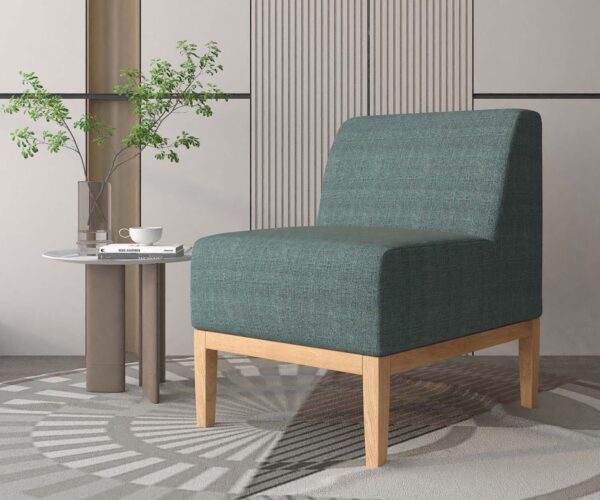
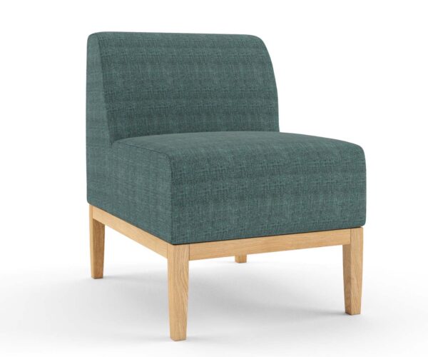
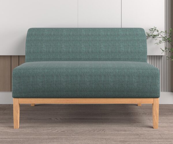
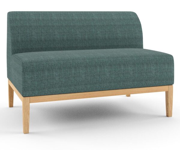
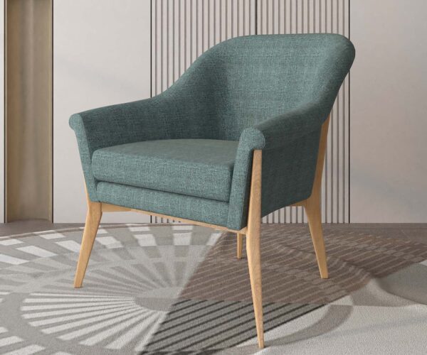
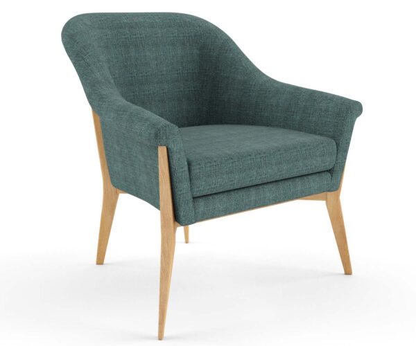
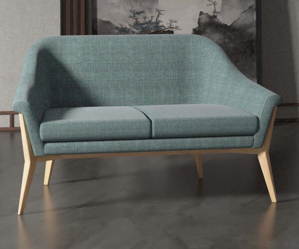
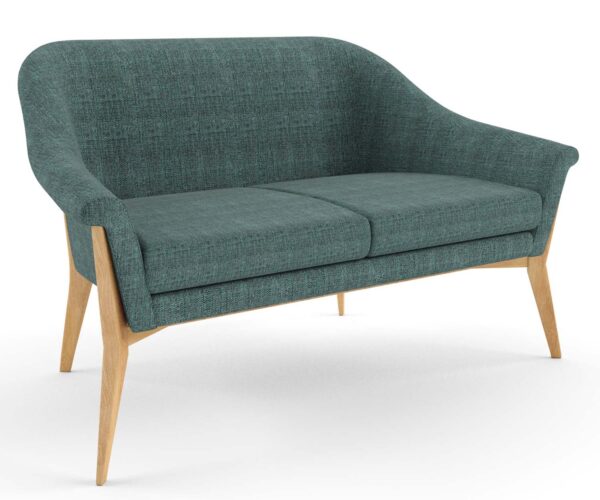
- Research-Backed Choices: Base your colour decisions on research that highlights the psychological effects of different colours. For example, blues and teals are known for their calming properties, making them ideal for creating a serene environment.
- Consider Cognitive Impacts: Select colours that support cognitive function and reduce confusion, especially in dementia care units. Research indicates that certain colours, such as solid, contrasting hues, can help residents with dementia navigate spaces more easily.
- Natural Light Interaction: Take into account how different colours interact with natural and artificial light within the facility. Colours can look vastly different depending on the lighting, so it’s essential to choose shades that maintain their intended effect throughout various lighting conditions.
Gather Stakeholder Feedback
- Resident and Staff Input: Conduct surveys or focus groups to gather preferences and needs related to colour schemes. Residents and staff can provide practical insights that align with the facility’s objectives.
- Family Feedback: Involve family members in the decision-making process, as they often have valuable perspectives on creating a comfortable and homely environment.
- Engage with Community Groups: Involve local community groups and organisations that regularly interact with aged care facilities. Their insights can provide a broader perspective on what colours and designs are generally well-received.
Implement Pilot Projects
- Test Colour Schemes: Try different colour schemes in small areas and monitor resident reactions. This can help you identify the most successful combinations before implementing them facility-wide.
- Seek Regular Feedback: Throughout the pilot project, actively seek feedback from residents, staff, and visitors. Use surveys, interviews, and informal discussions to gather comprehensive opinions on the new colour schemes and their impact.
- Monitor and Document Results: Keep detailed records of the pilot project, including before-and-after photos, resident feedback, and any observed changes in resident behaviour or mood. This documentation can help in making informed decisions for broader implementation.
Use Colour Coordination Tools
- Digital Renderings and Colour Swatches: Use these tools to visualise how different colours will look in your space. They can help you make more confident decisions.
- Virtual Reality Tools: Use virtual reality (VR) technology to create immersive simulations of different colour schemes in your facility. This can help you and your stakeholders experience how the colours will look and feel in a realistic setting before making final decisions.
- Colour Palette Apps: Leverage mobile apps and online tools that generate coordinated colour palettes based on a primary colour of your choice. These tools can suggest complementary colours, making it easier to achieve a harmonious look throughout the facility.
Practical Colour Recommendations
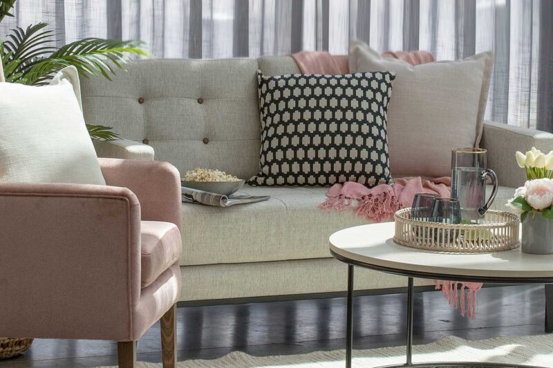
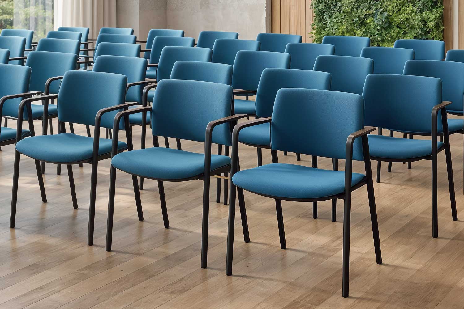
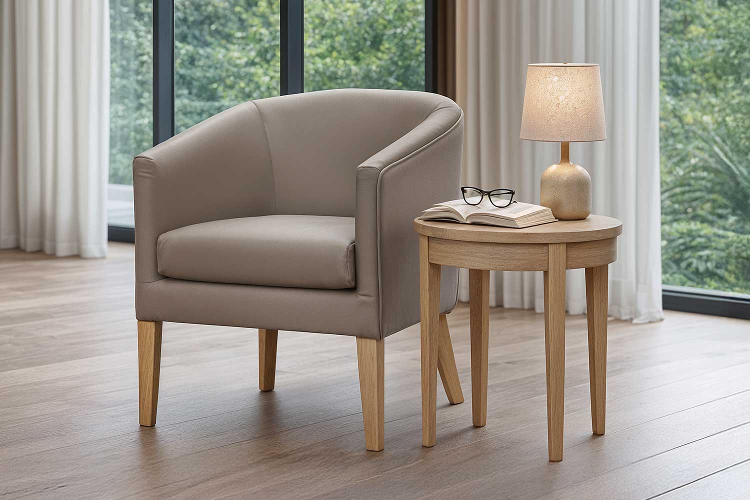
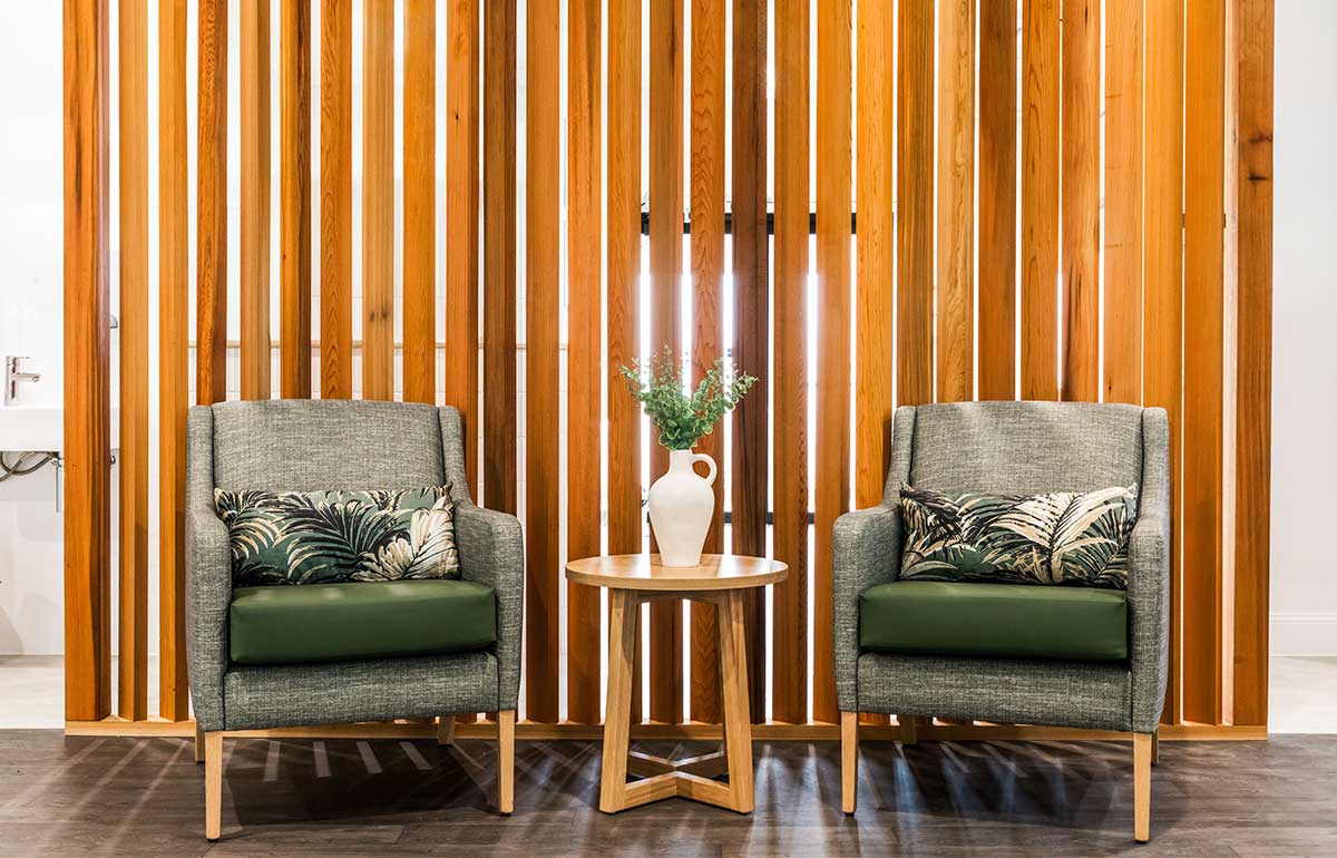
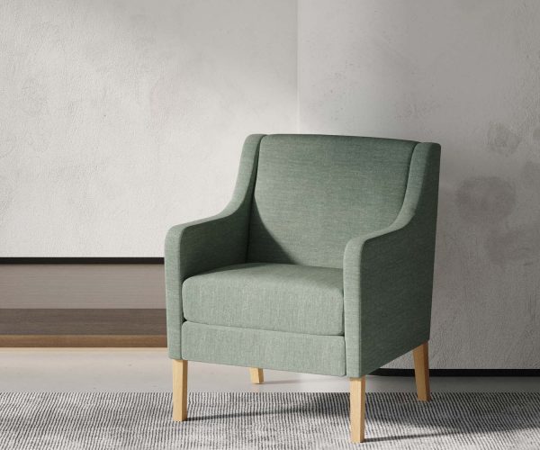
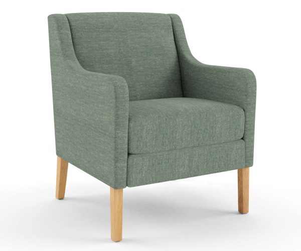
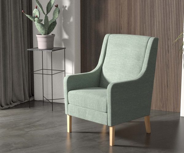
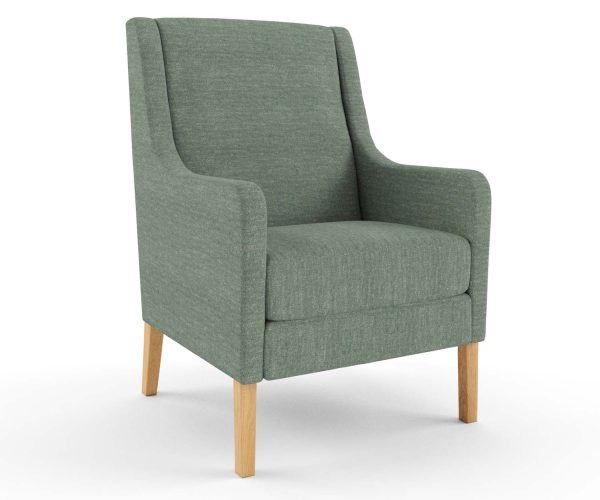
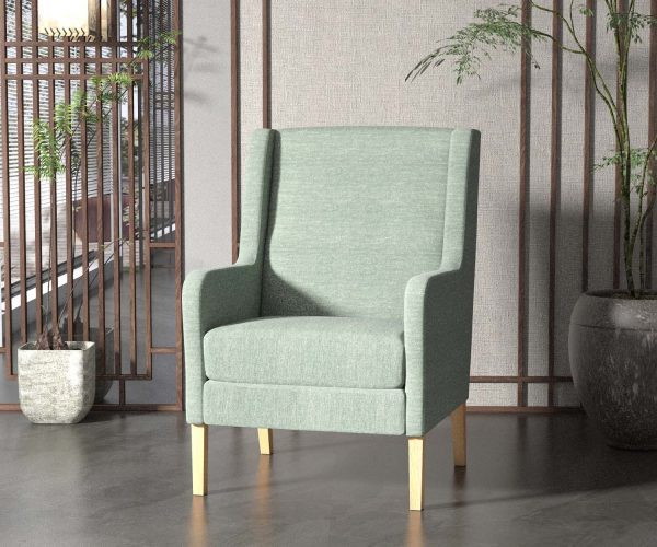
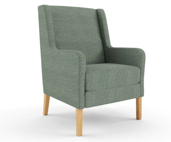
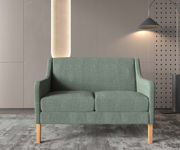
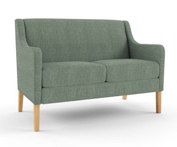
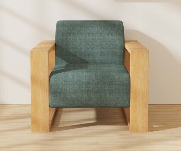
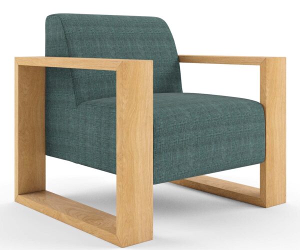
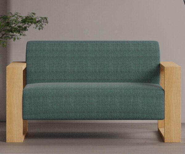
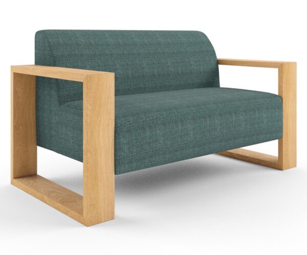
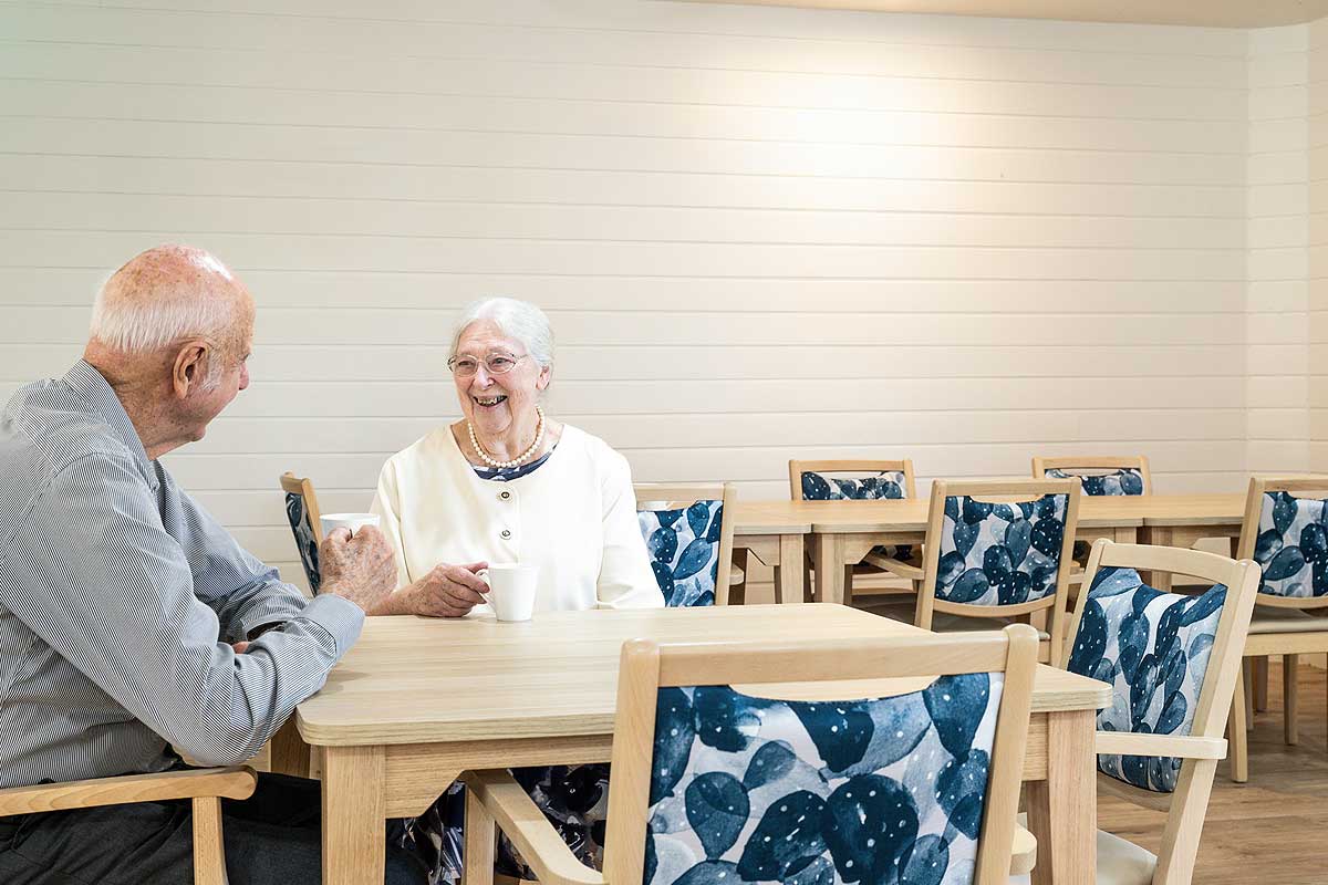
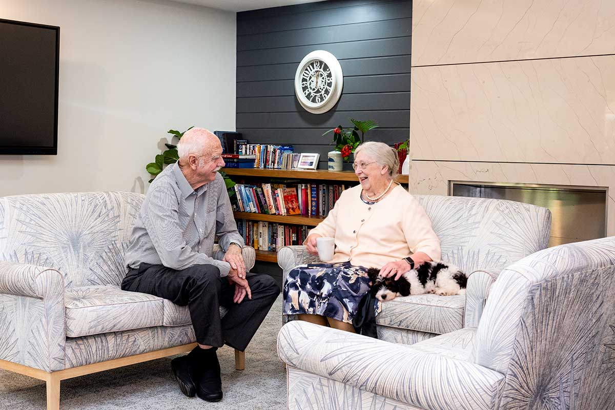
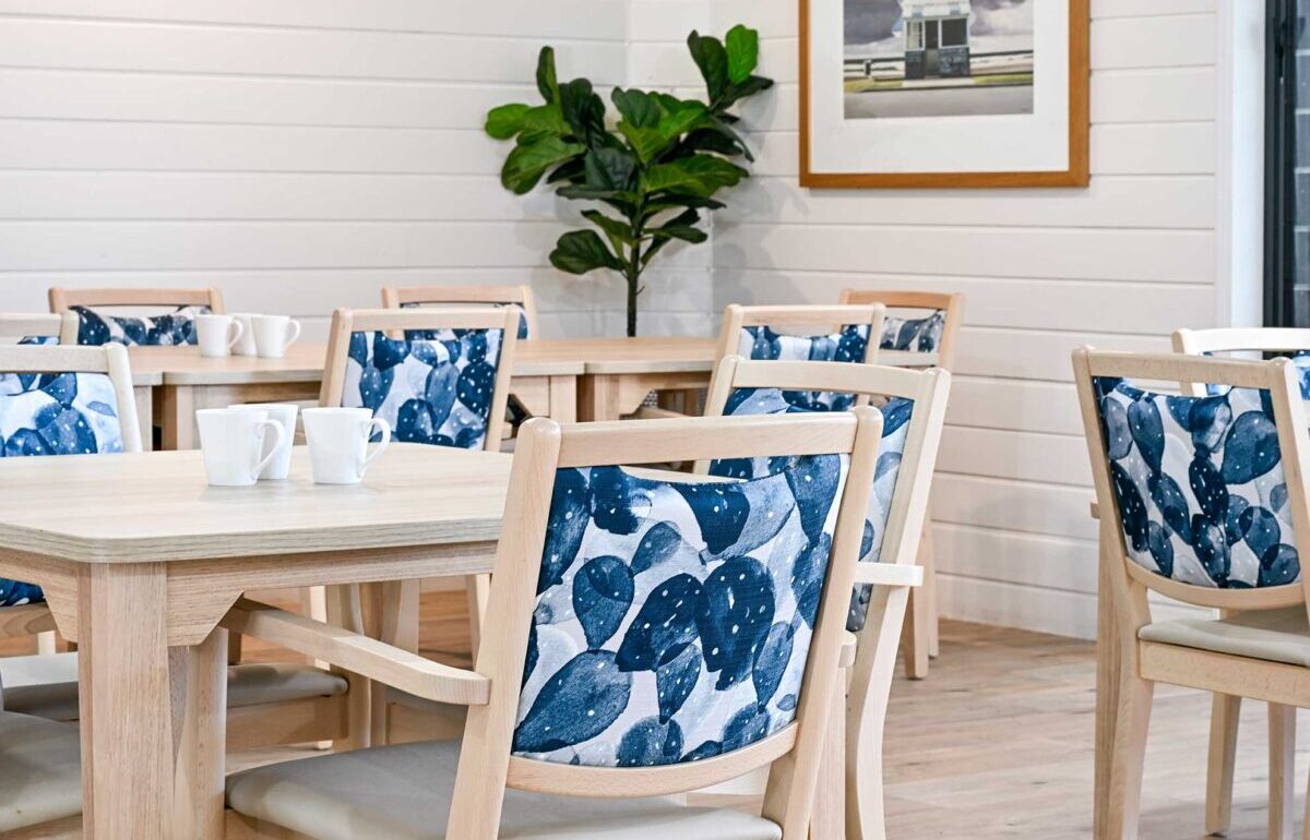
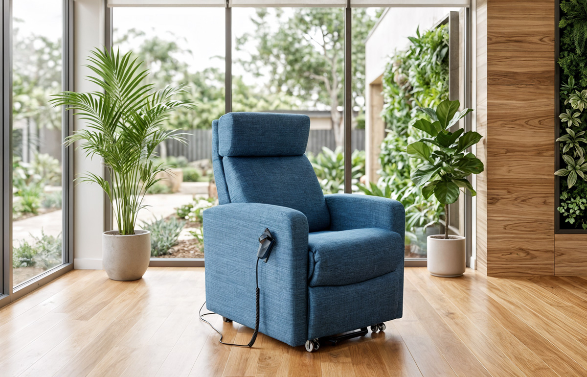
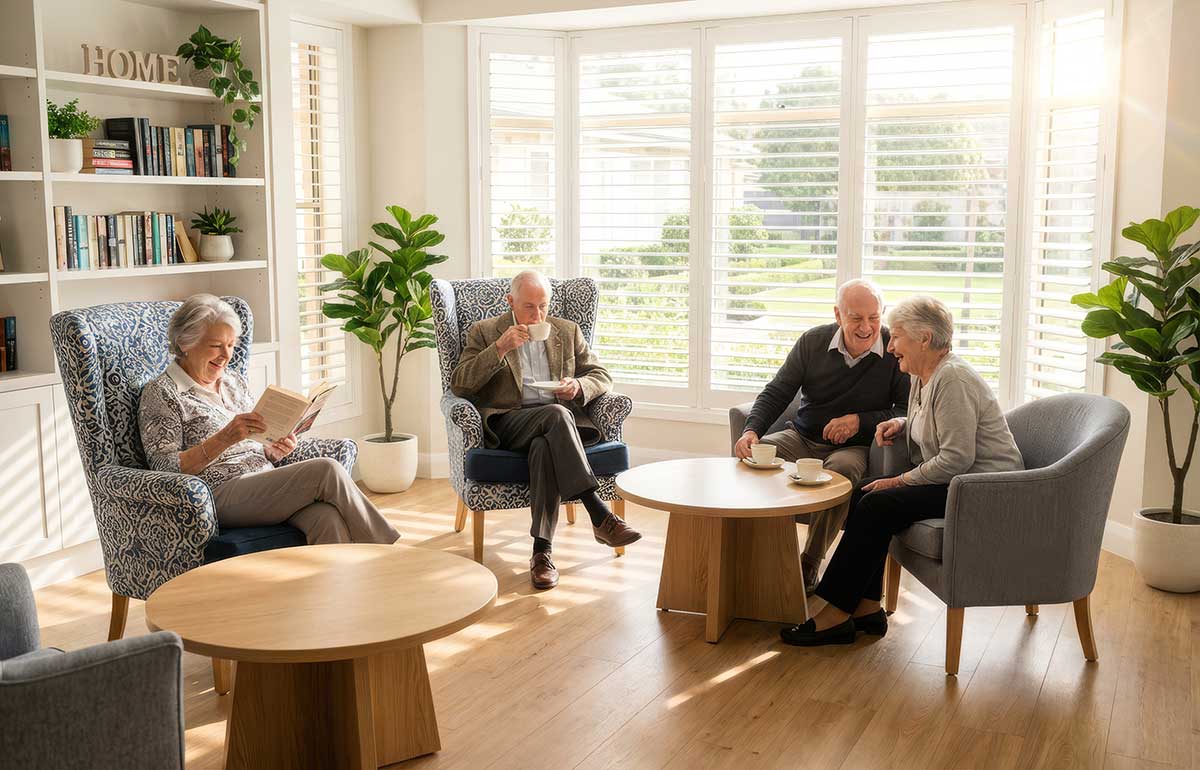
- Primary Colours: Opt for calming and versatile tones like blues, teals, and neutrals (greys, beiges). These colours create a soothing environment conducive to relaxation and comfort.
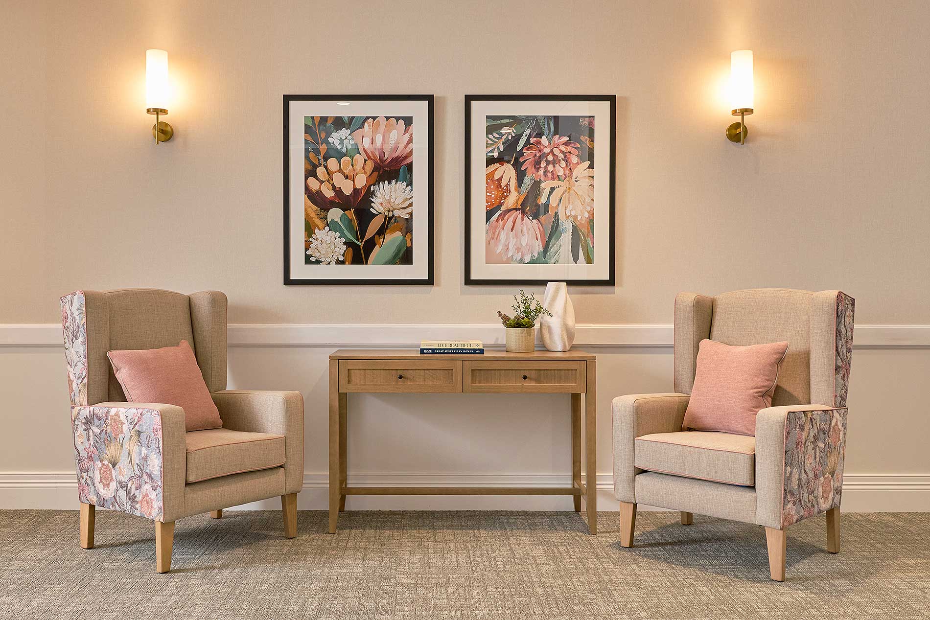
- Accent Colours: Use soft greens, blush pinks, and cool purples to add interest and warmth without overwhelming the space.
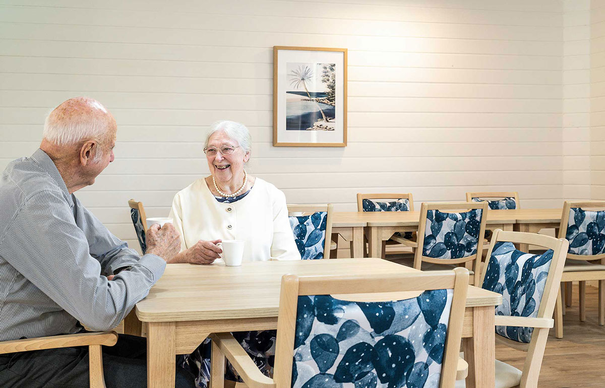
- Patterns vs. Block Colours: In dementia units, stick to block colours to avoid visual confusion. In general areas, subtle patterns can add texture without causing distraction.
Consider Practicality and Maintenance
- Durability: Choose fabrics that are easy to clean and maintain. Darker colours or patterns can hide stains better than lighter ones.
- Harmony with Existing Interiors: Ensure new furniture colours harmonise with existing décor elements like curtains, flooring, and walls.
- Waterproof, Non-Toxic and Hypoallergenic Materials: Choose fabrics that are waterproof, non-toxic and hypoallergenic to ensure a safe and healthy environment for residents, particularly those with sensitivities or allergies. Advancements in upholstery fabric technology mean that most of the beautiful, soft-to-touch fabrics used in aged care today are also waterproof.
The surprising furniture colour mistake aged care and retirement living services make is neglecting evidence-based colour choices. By consulting professionals, using research-backed decisions, gathering stakeholder feedback, and considering practical aspects, you can avoid this mistake. Embrace the process of selecting colours as an opportunity to create a space that is not only functional but also welcoming and aesthetically pleasing. By doing so, you enhance the well-being and comfort of your residents, making your facility a true home.
Australian Made Commercial Furniture: Suitable for Aged Care, Retirement Living and Other Accommodation Spaces
Recent Updates

The Surprising Furniture Colour Mistake Aged Care and Retirement Villages Make – And How to Avoid It
Choosing the right colours for furniture upholstery in aged care and retirement living spaces can be a daunting task. In our 25 years in the business, we’ve seen some facility and village managers unknowingly make a common mistake in their colour choices; and this can impact the comfort and well-being of residents.
Here, we’ll explore this surprising mistake and provide practical steps to help you avoid it, ensuring a harmonious and welcoming environment for residents.
The Importance of Colour in Interior Design
Colour is more than just a visual element; it plays a crucial role in influencing mood, comfort, and overall well-being. In aged care settings, the right colour choices can promote calmness, enhance mental health, and support mobility and independence. However, many facilities overlook the impact of colour, leading to environments that may not be as beneficial as they could be.
The Common Mistake: Neglecting Evidence-Based Colour Choices
The surprising mistake some aged care services make is neglecting evidence-based colour choices. Instead of relying on research and expert advice, they may choose colours based on personal preferences or outdated trends. This can result in spaces that are either too stimulating or too dull, neither of which are ideal for residents.
How to Avoid This Mistake
Collaborate with Furniture Consultants
- Partnerships: Work with furniture consultants to gain insights on current trends and practical advice on material choices.
- Samples and Mood Boards: Request fabric samples and create mood boards to visualise how different elements will come together.
- Trend Analysis: Stay updated on the latest trends in furniture design and upholstery fabrics by leveraging the expertise of consultants who regularly attend industry shows and events.
- Sustainability Considerations: Work with consultants to choose eco-friendly and sustainable materials, ensuring that your facility supports environmental initiatives and promotes a healthier living space for residents.
- Custom Solutions: Engage with consultants to create custom furniture pieces tailored to the specific needs of your residents, incorporating both aesthetic preferences and functional requirements.
Use Evidence-Based Design
- Research-Backed Choices: Base your colour decisions on research that highlights the psychological effects of different colours. For example, blues and teals are known for their calming properties, making them ideal for creating a serene environment.
- Consider Cognitive Impacts: Select colours that support cognitive function and reduce confusion, especially in dementia care units. Research indicates that certain colours, such as solid, contrasting hues, can help residents with dementia navigate spaces more easily.
- Natural Light Interaction: Take into account how different colours interact with natural and artificial light within the facility. Colours can look vastly different depending on the lighting, so it’s essential to choose shades that maintain their intended effect throughout various lighting conditions.
Gather Stakeholder Feedback
- Resident and Staff Input: Conduct surveys or focus groups to gather preferences and needs related to colour schemes. Residents and staff can provide practical insights that align with the facility’s objectives.
- Family Feedback: Involve family members in the decision-making process, as they often have valuable perspectives on creating a comfortable and homely environment.
- Engage with Community Groups: Involve local community groups and organisations that regularly interact with aged care facilities. Their insights can provide a broader perspective on what colours and designs are generally well-received.
Implement Pilot Projects
- Test Colour Schemes: Try different colour schemes in small areas and monitor resident reactions. This can help you identify the most successful combinations before implementing them facility-wide.
- Seek Regular Feedback: Throughout the pilot project, actively seek feedback from residents, staff, and visitors. Use surveys, interviews, and informal discussions to gather comprehensive opinions on the new colour schemes and their impact.
- Monitor and Document Results: Keep detailed records of the pilot project, including before-and-after photos, resident feedback, and any observed changes in resident behaviour or mood. This documentation can help in making informed decisions for broader implementation.
Use Colour Coordination Tools
- Digital Renderings and Colour Swatches: Use these tools to visualise how different colours will look in your space. They can help you make more confident decisions.
- Virtual Reality Tools: Use virtual reality (VR) technology to create immersive simulations of different colour schemes in your facility. This can help you and your stakeholders experience how the colours will look and feel in a realistic setting before making final decisions.
- Colour Palette Apps: Leverage mobile apps and online tools that generate coordinated colour palettes based on a primary colour of your choice. These tools can suggest complementary colours, making it easier to achieve a harmonious look throughout the facility.
Practical Colour Recommendations
- Primary Colours: Opt for calming and versatile tones like blues, teals, and neutrals (greys, beiges). These colours create a soothing environment conducive to relaxation and comfort.
- Accent Colours: Use soft greens, blush pinks, and cool purples to add interest and warmth without overwhelming the space.
- Patterns vs. Block Colours: In dementia units, stick to block colours to avoid visual confusion. In general areas, subtle patterns can add texture without causing distraction.
Consider Practicality and Maintenance
- Durability: Choose fabrics that are easy to clean and maintain. Darker colours or patterns can hide stains better than lighter ones.
- Harmony with Existing Interiors: Ensure new furniture colours harmonise with existing décor elements like curtains, flooring, and walls.
- Waterproof, Non-Toxic and Hypoallergenic Materials: Choose fabrics that are waterproof, non-toxic and hypoallergenic to ensure a safe and healthy environment for residents, particularly those with sensitivities or allergies. Advancements in upholstery fabric technology mean that most of the beautiful, soft-to-touch fabrics used in aged care today are also waterproof.
The surprising furniture colour mistake aged care and retirement living services make is neglecting evidence-based colour choices. By consulting professionals, using research-backed decisions, gathering stakeholder feedback, and considering practical aspects, you can avoid this mistake. Embrace the process of selecting colours as an opportunity to create a space that is not only functional but also welcoming and aesthetically pleasing. By doing so, you enhance the well-being and comfort of your residents, making your facility a true home.